Thursday, October 13, 2016

Donate a Life- Kinetic Typography

I was asked to do a kinetic typography for the organization Gift of Life.  For this project I was given an infographic and was asked to make an animated version of it. I worked with Mr. Netterville on this project to make sure it looked well enough to show at their keynote speakings. 

Starting the Project

Scripting

Before anything, I needed to type a script so I'd know how I wanted to animate the text. The script can take the place of a storyboard, as its easier to visualize text there and take notes. They did not want audio, so I didn't have to have a voice script. While I did type it, I printed the script so that I could take notes and write in changes.

Setting Up

After scripting, I needed to find the proper font they use in the into slide, as well as pick colors that fit together and made the proper things stick out. Going through the script, I found things I wanted to have visuals for, so I went into photoshop and made the proper graphics. We also contacted the one asking for the animation and got a few different copies of the logo that I could use in the end slides

Animating 

Animating took up the most time in this project, as expected. All of my animation was done in Adobe After Effects. I broke this into a few compositions so the harder animations would look simpler on the main composition.

Separate Compositions

The fade in and out at the beginning and end of the "LIFESAVERS" on a red solid is a separate composition placed in the main for simply the purpose of having a few layers less. All I did in the composition was edit the opacity so it could fade correctly.

One of my favorite compositions in this animation is the number flip. It is used in the beginning statistics, and changes with different facts. You have to manually enter the coding in one of the portions of the transform on the layer to get it to move, but then its very easy to get the numbers to change. You only use keyframes and slide the numbers to change. The rest is a matter of timing with the animation on the main composition.

Magnifying Glass

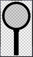
Another favorite part of the composition was the magnifying glass that goes over the "Get Clued In" text right after the intro animation. Mr. Netterville did a lot of the work to get it to magnify the text, so shout out to him.

Originally I made the glass three colors, and the center where the glass is was a semi-transparent blue color. After modifying the colors in the animation we changed the magnifying glass to black, and I made the center glass a very transparent white-ish grey. For a while, it just scrolled over the text without magnifying the text at all.

When final details were being done on the animation Netterville wanted to make the glass actually magnify the text. Its done with an adjustment layer over the circle of the magnifying glass that literally magnifies the layers its going over. It took a bit of messing around to get it to follow the text and magnify it properly, but it ended up working out!

Word Scrolling

One of the most tedious parts was the scrolling of the different organs and tissues you can donate. It was originally its own composition but with aligning troubles, we threw all the text onto the same layer to get it to align better.

Having all the text on one layer made it hard to both move the text and be able to work up close to the composition. We had to constantly zoom out to make sure the text moved by evenly on the screen and not down at all. It was also hard to set and change keyframes with the giant layer of text we had.

Ending + Final Thoughts

The animation had to be rendered a few times, most for new edits in the animation, and one because for some reason the original render did not work for the client. After rendering on After Effects as a Quick Time (.mov) I had to take it over and convert the .mov to an H.264 in Adobe Media Encoder.

Final Thoughts

I enjoyed creating and sharing this project with my client. It was a challenge to jump from the typographies I have previously done to this one, but I do think I have grown and gotten quite a bit better in this skill set. As Netterville said, to be able to do kinetic typography, you have to think like a graphic designer. That didn't challenge me too much, but it helped to try and consciously think of that. The most challenging part of this animation was probably the timing. Even though there was no audio to time it too, you still have to make sure nothing is too fast or too slow. In the future I'd love to use more graphics to illustrate the text and make the animation more lively if I was given the time.

Wednesday, May 18, 2016

End of Year Final

This year I was able to grow as an animator and develop more skills with new equipment available to me. I received a tablet, and was taught how to use the light box. My projects this year consisted of a kinetic typography, a stop motion animation, a character animation, and a small story animation. 


Typography

You can read the blog about my typography here.
I decided to do a kinetic typography at the beginning of the year because in my mind it was relatively simple, they weren't common, and I loved the idea of it. I was wrong about the simple part. I believe we did our first typography freshmen year, and I posted mine here. You can see my improvement from that one to my 7 Nation Army typography. One way I improved was keeping a constant style, and using one font that fits the style of the song. While I know I need improvement, I am extremely proud of this animation. I'm glad I started with this project this year, because it helped me get used to After Effects again.


Stop Motion

I do not have access to the stop motion animation.
My second project of the year was the stop motion animation, which I did with Hanna Brady, Hannah Fails, Jessica Love, and Maddison Redmond. We actually combined the stop motion with our own digital animations. We had to collaborate a lot on this project and put in a lot of extra time to be able to get a finished project worth sharing. I am happy with the outcome, and wish I had it to share.

Character Animation

You can watch my character animation here
During the pre-Emagine work time I had to come up with a project to enter, and I didn't want to enter my typography. I made a very short frame by frame character animation with my drawing tablet and Photoshop. This was done in a few days, and started with a basic character sketch that I wanted to play with. I didn't win anything, nor did I expect to with the amount & quality of the other entries.

Story Animation

At the time of this blog I am still working on the animation, but you can watch the storyboard here
This is my final animation for the class this year, which I probably overshot time wise. I should have managed time better, but I'm happy with what I have, and I think it will make good. I learned a lot with this animation, including how to jerry rig the hardware on your tablet to get it to work correctly, and why you should always have tape when you have a cracked tablet pen :)


Final Thoughts

I think the biggest thing I've learned this year is time management. It is very important.

Thursday, May 12, 2016

An old video I'm posting for the sake of watching.


I Don't Have Enough Money For Photoshop Alternatives

Photoshop is a very nice utility to have, whether you are an animator, graphic designer, photographer, among many other professions! Sadly, a lot of people are unable to get access to this program to practice and grow their skill, or even learn they have it.  Little known to some people, there are a few programs that work almost as well as Photoshop that you can get for free. All programs are ones I have used and would recommend.

Free Painting Software FireAlpaca


The brushes!
Fire Alpaca is a Japanese art program you can download and use on your desktop. This program is for both mac and windows! It's interface is really only made for art and drawing. 
It has quite a few types of brushes and filling tools, The latest update has included the ability to download and create your own brushes! All the default brushes (-fire alpaca brush) including Blur, smudge, and both erasers, work with pen pressure if you use a drawing tablet. I haven't seen anyone who's had a problem with it. For the fill tool, you must have closed lines- even one pixel can screw you up. For the gradient, make sure you have utilized both your foreground and background colors, as those are what will be used in the gradient (ex; i used black and brown.) Before you fill the gradient you have to fill in the shape with a solid color, then turn protect alpha on that layer, otherwise the gradient will fill the entire canvas.  
Another new feature added in the latest update is a comic book selection! You can create your own templates, or use ones already given to create panels like in a comic book.


The only file type Fire Alpaca can save and open with layers intact is a .mpd. It can save .jpg, .png, and .bmp. If you draw on this program, but want to move it with layers to Photoshop, another program called Medibang Paint Pro can open both .mpd and .psd files, and is able to change .mpds to ,psds. Link to Fire Alpaca main page (translate from Japanese) 
OIE Logo
As you mess around, you can find a lot of different things on Fire Alpaca. Using command/control T for freetransforming a layer is a thing, as well as selection tools & rotation. Over all, though, Fire Alpaca is a pretty basic tool, and I don't use it often.

Online Image Editor is a web editor. I use it for editing gifs, mostly. For your canvas you can upload an image from your computer or url, or create a blank canvas. It does have transparency, and automatically saves as what ever file type you upload it as. Be careful, because you can only have one file open at a time (even if you try to multi-tab.)
selecting a frame for your gif or photo.
OIE is pretty basic, but very helpful for what I use it with! The most basic tools which I use frequently is re-size and crop. These tools work almost the same as they would any other program, except you can preview what it would look like before you apply it. There is also a basic type tool, but it doesn't have many fonts to pick from. There's lots of fancy tools that I don't think anyone uses because lets face it. Glitter text is cheesy looking. My favorite tool to use is the shape cutting tool. I use it when I am making gif avatars for myself or others on forum websites, along side the re-size. There are quite a few frames you can pick from. I generally use the square or the large circle, but I do sometimes go to the fun frames if they fit with the theme or if someone requests it. Before applying the frame, you can re-size the photo and/or frame, move the frame around, and edit the "fuzz factor", which is really just the blur or fade on the edges of the photo. Mostly I just re-size the frame and move it around so that the photo fits. If I do have to re-size the photo, I make sure not to re-size it enough to make it all pixelated.
When you want to save your photo, you have the option to save it straight to the downloads on your computer (you cannot name it before hand, you will have to go in and move and rename it), or uploading it to Facebook or a webapp called Picassa. Here's my finished photo if you'd like to see!
I really enjoy OIE for my forum coding purposes. I often use it in pair with Pixlr, as they do well with creating, cropping, and re-sizing images to fit my forum formats. I've created a lot of cool stuff using both programs, which I'm sure I'll blog about in the future! Link to OIE main page

Pixlr Editor is one of my favorite free programs to use to date, as it is super close to Photoshop in both interface & tools. You can use Pixlr through its web app or download it to your desktop, though I prefer the web app because it has all the same capabilities and is quick to access. Pixlr is by autodesk!!! Through the web app, you can open a photo from your computer, a url, or from any sort of library (Pixlr photo library, Facebook, ect.) 
I made the background
transparent and added the bars
In this image I fixed the
transparency and added the card
to the background
I use Pixlr for a lot of graphics for my forum posts, and I edit a lot of images on it. Lots of times I take the color schemes and make things with them such as borders. The tools I use most are the shape tool (line), the color picker tool, and when removing backgrounds from images, the select tools. I don't actually have much to say about this program, because its so much like Photoshop, but I have a few items I've made to show what you can do on the program! link to pixlr main page.


Coding Using work from OIE and Pixlr paired

All the images were coded (via bbc) into a forum. I may have made the silhouettes on photoshop, but i dont recall. This was made way before I realized those pixels in the gifs were bad. 

Wednesday, April 6, 2016

Emagine 3: Chipwrecked

Ok, this is NOT my third time going to Emagine. Its probably my seventh-- but this WAS my third time going as a student in the e-Comm program!


Before the event, I went out with some friends to dinner at Hoolihans, then we took a bunt of photos at the Horticulture Center (It's too pretty not to take photos at!)


The Actual Event: Electric Boogaloo 

I've gotten to go to Emagine a lot, due to my brothers being in e-Comm, and because of that I have gotten to see as the event grows and becomes more popular with other schools attending. I remember it always being crowded, and having quite a few entries, but watching quality grow and more people being involved it always great!

This year, quite a few of my friends entries got in top five, and most of those got in the top three! It was very exciting to see their works up there and hear people cheer and clap for it. I am very proud of Hanna Brady and Jessica Love for getting pixels! A few of my favorite works in the animation categories were Running Girl, Generic Dragon, and of course Gummy Bear.

The consistencies I noticed in top three entries are all things you should notice in all animations, simple things like smoothness, consistency/ continuity, among other things.

My Entries

I entered two animations this year, rivaling my previous zero. My first entry was in the character animation category, and you can read my blog post about it HERE. My second entry was with a group, Maddison Redmond, Hanna Brady, Hannah Fails, Jessica Love, and myself, and we entered our stop motion animation into the story category. 

Wednesday, March 2, 2016


Chikari Transformation Cycle 

A short animation of my character Chikari transforming into a magical girl for the eMagine Media Festival. I have entered it into the character animation section. I am happy with how it came out, but I may take spare time to clean it up and add more frames for a smoother transition.


Character Design

The character, Chikari, was not something I had planned to animate at all when I started. To be honest I was just messing around when I was drawing, but decided I really liked her. I was messing with some old prisma color markers when I decided the two colors of her hair. A majority of the design happened on photoshop, but her outline and reference were all in my sketchbook. I asked a few people for the colors they preferred on the hair, but did end up going with my original idea. The hair style changed a little from my original drawing. Her magical girl form just kind of happened. I never had a plan for it before hand, but I think it turned out well. I tried shading the side photo a little. I am really happy with how she turned out design wise.

Animating in Photoshop

My initial animation was done in photoshop. The animation has a total of 45 unique layers and 5 video groups; the side image has multiple layers on top of each other set inside a folder. The hardest part of the animation was making sure I was on the right layer, and in the right video group. For each frame I copied the lines from the layer before and edited them to fit the next action, then copied the color from the previous frame and fixed it so they fit the lines.
The things you need to click to use a double
workspace.

Working with two veiws

For a lot of the drawing, I would usually have to find myself zooming out to see it full size and the character reference to the art on the left. Instead, I went to the window tab on Photoshop and clicked "open another tab of chikari.psd" then arranged the workspace so that both of the same file were placed next to each other. They work as two different files in some ways. You have to click over if you want a color pick from the full image or anything; but the files do save as one, and when you do something to one side, while it takes a second, it shows on the other. Its very useful when doing frame by frames and working with fine details.
Two-view workspace!