Starting the Project
Scripting
Before anything, I needed to type a script so I'd know how I wanted to animate the text. The script can take the place of a storyboard, as its easier to visualize text there and take notes. They did not want audio, so I didn't have to have a voice script. While I did type it, I printed the script so that I could take notes and write in changes.Setting Up
After scripting, I needed to find the proper font they use in the into slide, as well as pick colors that fit together and made the proper things stick out. Going through the script, I found things I wanted to have visuals for, so I went into photoshop and made the proper graphics. We also contacted the one asking for the animation and got a few different copies of the logo that I could use in the end slides
Animating
Animating took up the most time in this project, as expected. All of my animation was done in Adobe After Effects. I broke this into a few compositions so the harder animations would look simpler on the main composition.
One of my favorite compositions in this animation is the number flip. It is used in the beginning statistics, and changes with different facts. You have to manually enter the coding in one of the portions of the transform on the layer to get it to move, but then its very easy to get the numbers to change. You only use keyframes and slide the numbers to change. The rest is a matter of timing with the animation on the main composition.
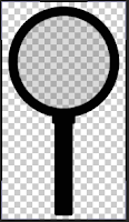
 Another favorite part of the composition was the magnifying glass that goes over the "Get Clued In" text right after the intro animation. Mr. Netterville did a lot of the work to get it to magnify the text, so shout out to him.
Separate Compositions
The fade in and out at the beginning and end of the "LIFESAVERS" on a red solid is a separate composition placed in the main for simply the purpose of having a few layers less. All I did in the composition was edit the opacity so it could fade correctly.One of my favorite compositions in this animation is the number flip. It is used in the beginning statistics, and changes with different facts. You have to manually enter the coding in one of the portions of the transform on the layer to get it to move, but then its very easy to get the numbers to change. You only use keyframes and slide the numbers to change. The rest is a matter of timing with the animation on the main composition.
Magnifying Glass
 Another favorite part of the composition was the magnifying glass that goes over the "Get Clued In" text right after the intro animation. Mr. Netterville did a lot of the work to get it to magnify the text, so shout out to him.
Originally I made the glass three colors, and the center where the glass is was a semi-transparent blue color. After modifying the colors in the animation we changed the magnifying glass to black, and I made the center glass a very transparent white-ish grey. For a while, it just scrolled over the text without magnifying the text at all.
When final details were being done on the animation Netterville wanted to make the glass actually magnify the text. Its done with an adjustment layer over the circle of the magnifying glass that literally magnifies the layers its going over. It took a bit of messing around to get it to follow the text and magnify it properly, but it ended up working out!
Word Scrolling
One of the most tedious parts was the scrolling of the different organs and tissues you can donate. It was originally its own composition but with aligning troubles, we threw all the text onto the same layer to get it to align better.
Having all the text on one layer made it hard to both move the text and be able to work up close to the composition. We had to constantly zoom out to make sure the text moved by evenly on the screen and not down at all. It was also hard to set and change keyframes with the giant layer of text we had.
Ending + Final Thoughts
The animation had to be rendered a few times, most for new edits in the animation, and one because for some reason the original render did not work for the client. After rendering on After Effects as a Quick Time (.mov) I had to take it over and convert the .mov to an H.264 in Adobe Media Encoder.
Final Thoughts
I enjoyed creating and sharing this project with my client. It was a challenge to jump from the typographies I have previously done to this one, but I do think I have grown and gotten quite a bit better in this skill set. As Netterville said, to be able to do kinetic typography, you have to think like a graphic designer. That didn't challenge me too much, but it helped to try and consciously think of that. The most challenging part of this animation was probably the timing. Even though there was no audio to time it too, you still have to make sure nothing is too fast or too slow. In the future I'd love to use more graphics to illustrate the text and make the animation more lively if I was given the time.
No comments:
Post a Comment