Tuesday, September 30, 2014
Font tutorial
This is my font tutorial. I had trouble tracing once I got all the brush styles combined. It did not curve well. I would like to learn how to make it curve better so it would look good.
Tuesday, September 23, 2014
About the Google Logo.
The original google font was created in 1998 The font used was bakersfeild bold. It was held from September to October. The second logo added the "!" in November 1998 and lasted to May 1999. On May 31st, they took out the "!", added "tm", gave the text a shadow, and made it thiner. It kept the same 3D effect. This change stayed all the way until May 5th, 2010. On May 6th, they removed both the trademark and shadow, though keeping all previous added things. This changed on September 18th, 2013. They only made a minor change to the current logo, removing most of the 3d effect, and rounding out the shapes.
Friday, September 12, 2014
Character Walk
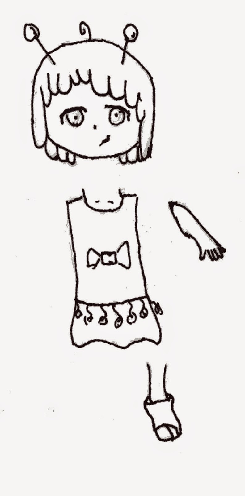
 This is the character I used for my character animation. A lot of editing was done to her in photo shop. She is an alien version of myself. I designed her to be a simple character, that doesn't stand out too much.
  Here is my animation time line. My main issue was keeping the legs from popping out of her body, i.e; staying under the skirt. Then I had to put that animation in the new one, and connect her legs and body. I positioned the body on the right of the screen and put in the key frame. then I moved the scrubber to the end, and moved my character to the left. It added a key frame.
This is my character animation. I learned about scanning and fixing drawings from photo shop, working with timing, and copying key frames. My biggest issue was getting my characters legs to keep from poking out on the sides as they circled. If I could change anything, it would be the cycle of the legs. I think they go a little too high. I am pretty proud of my animation.
This is my updated walk cycle. I added a background, and made her less tilted. I enjoyed using different brushes to make a new world, never seen before.
Thursday, September 11, 2014
Font Diagram
In this project we had to find a font that best suits us. I got Rogue Script. Next we had to diagram parts of the font. This project is actually really easy in my opinion because the style makes things more visable.
Friday, September 5, 2014
Worm Cycle
This is my inch worm. In this project we had to animate a worm moving across the screen. We used the puppet tool to get the worm to change its shape and bend, then put that animation into a new one, where we had it inch across the screen. We used photoshop to make the grass and the worm.
Subscribe to:
Comments (Atom)

