Showing posts with label graphic design. Show all posts

Friday, May 15, 2015

Glitter BOX


box template
Armstrong Seal of Approval
The product I picked for this project was Glitter Box. Originally, It was going to be a box that sprayed glitter when you opened it, but then I found out about edible glitter. So instead, it is pills of glitter you can put in your drinks, put in cake mixes, or just eat as the tablet its self. I had a lot of fun designing the box. It's colors reflect the happiness and upbeat emotions of glitter. The design and font is all simple. The font is called Manga Temple. I used it for the logo font (both the text and initials), and on the testimonies. For the seal of approval I used Myrad Pro, trying to match the labels on the back. The right side has a seal that says "Armstrong Approved." It is to show that the glitter does in fact sparkle to the best of its standards.  I tried to make the bottle label simple. I wanted the entire bottle to be the same color, so the label blends into it. The yellow was made as the label color because it seems like more of a pill or medication associated color. I only put the glitter box logo on because I didn't want it to be over complicated. Because the bottle comes in the box, I didn't feel it needed the bar code. I'm all about simplicity.
Label
3d revolve

My 3d revolve was fun, but gave me the most problems. I had trouble getting the box to be pink and mask the yellow to make just the sides yellow. The bottle was also hard, because in order to make it look good, you had to get the proportions exact. After I made the box and bottle, I decided to make the pill itself, which was easy. The only problem with that is that, due to its texture, it does not look 3d. I do still like it and would not change that part. My logo design was my favorite part. I went through a lot of concepts and enjoyed each and every one of them. I had to design the icon, font, and initials at different times to see what looked best, then I could put my favorites together to see that. A lot of my fonts were customs I found online. In the end I did decide on one that worked for both my full text and initials. I was trying to decide between upper and lower case for them.
font ideas
icon


initials ideas


glitter pill texture.

more font stuff
logo ideas
final logo design


Friday, April 10, 2015

Custom type

         We made our custom type in adobe illustrator, using a tutorial. The font I used was "Baby, You're a Star" which is a font I downloaded for an old project. Originally, all the text was in one line. We had to expand the text, turning it into objects with points, to be able to move it. I ungrouped the "apple" from the "organtics" so I could move the organtics on its own. I liked the first p in "apple" and the r in "organtics" to make the drop down and the lead up look like they were the same. The second p also ended up looking merged with the g.

Thursday, March 5, 2015

Top Ten

the X means there
will be an image.
The filled in means there
will be empty space
We've been working on a new project for about two weeks. It is our Top Ten posters. We were introduced to in design. To begin we had to look up and sketch some concept grids that we liked for our poster. I really liked a lot of the simple ones like shown. I ended up going with my own design, where the text is always right of the photo. I pulled my grid and made it in in design. Next I found all the photos. The first few (Fullmetal Alchemist, Google Chrome, 3DS) were easy. All I had to do was throw them in and center them. For music I could not decide who I wanted to be my image, so I took a picture of Marina and a picture of Nicki Minaj, and I cut both in half so that it could be one photo with both of them, while maintaining a good size. For my cosplay and horse photos, I had to edit it out, so the main focus was the cosplay and the horse. With my picture of my dogs, my friends, and my family, I had to correct the colors quite a bit. They were dark, and you could hardly see anything. But they look a lot better now. The color design I picked was because it is pretty like me. The filler photos were picked to match. After i set the background I had to set the fonts. for the heading (in pink) I downloaded the free font "Baby, you're a star". I really like how pretty it is, and how it relates to me. for the subheadings (in blue) I used the font "Letter Gothic Std". It fits in well with the simple theme, drawing attention, but not distracting. For the body I used PT Serif. Its simple and easy to read.


Tuesday, December 16, 2014

Postcards

This is my "Fall" Clipping mask. I used flowers for my name because flowers are pretty and I'm pretty. I uses the clouds because it blends well with the letters.


This is my clipping mask post card. I themed it around Madoka Magica. I used each character for the letters. I used a background from the show for the back. I put the text as "Queen" because the magical girls are prefect and flawless.


This is my "Hawaii" post card. My theme was people I like (and a plane). The text says "More than one waif can ruin your laifu". People featured are Lemon, Cookie, Oliver, Onion, A Plane, Mio, Marina, Kyray, Mami, and my date friend Lee B)

Thursday, November 6, 2014

Madoka and a mountan


This is our floating mountain project. It was pretty easy to follow the directions. I think the hardest part was adding the tip and getting rid of the water in front.  I really liked bringing the cloud up, so i did it a few times. To personalize it, I added Madoka Kaneme and Kyubey from Madoka Magica. pls make contract 2 become magical girl ty.

Thursday, October 23, 2014

Is that supposed to insult me?


I was bored so I made this thing. Its Oliver Armstrong from Fullmetal Alchemist Brotherhood. She is a queen. The photo is supposed to represent how using 'girl' as an insult is dumb, because girls are just as good as boys.

Spheres


 This is my Illustrator ball. I made a circle without a fill or stroke, then added a gradient while the ball was selected. For the gradient I used white, a light grey, a red, and a darker red. The shadow is a gradient of black, grey, white, and transparent. The sky is blue and transparent, and the grass is just a solid green.
This is my Photoshop sphere. I made it more pink than red. The ball has two layers, the main color and the shadow. I pretty much did the same thing I did with the Illustrator ball.


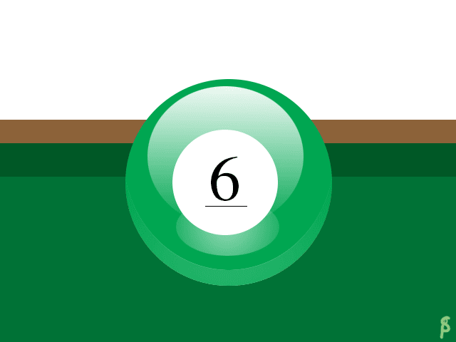
This is my PS tutorial ball. I did a Billiard ball. One part I had trouble with the shine just below the number. I solved it by, instead of feathering, making a gradient white circle and making it transparent. To make it my own, I made the ball green, with the classic 6 instead of the black 8 in the tutorial. Tutorial link.
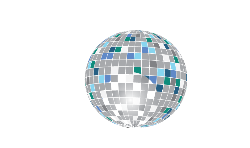
This is my AI tutorial ball. It is a disco ball. I didn't really have any troubles with it. I used a few different colors of blues for the coloring, and a gradient white & black screen circle to make that shine, though it did not turn out well. Tutorial Link.

Thursday, October 2, 2014

Personal logo


This is my logo sketch. I sort of stuck to one design with the D, S, and P. D is for my first name Danielle, S is for my last name Sleigh, and P is for my nick name, Pastel. I also just learned how to do that star. I really like it.

This is my art board. I tried a few more designs, including a heart with a lions made. I liked the star with the DSP and a lot of the sketches on the first board. I still went for the dap.


This is my final choice for my logo. It is the D and the P inside the S. The font is simple, and fits together, like my personality. The color is pastel pink, a somewhat elegant color. I really like it because its cute.

Tuesday, September 30, 2014

Font tutorial

This is my font tutorial. I had trouble tracing once I got all the brush styles combined. It did not curve well. I would like to learn how to make it curve better so it would look good.

Tuesday, September 23, 2014

About the Google Logo.

The original google font was created in 1998 The font used was bakersfeild bold. It was held from September to October. The second logo added the "!" in November 1998 and lasted to May 1999. On May 31st, they took out the "!", added "tm", gave the text a shadow, and made it thiner. It kept the same 3D effect. This change stayed all the way until May 5th, 2010. On May 6th, they removed both the trademark and shadow, though keeping all previous added things. This changed on September 18th, 2013. They only made a minor change to the current logo, removing most of the 3d effect, and rounding out the shapes.

Thursday, September 11, 2014

Font Diagram

In this project we had to find a font that best suits us. I got Rogue Script. Next we had to diagram parts of the font. This project is actually really easy in my opinion because the style makes things more visable. 

Friday, August 29, 2014

adobe illustrator projects


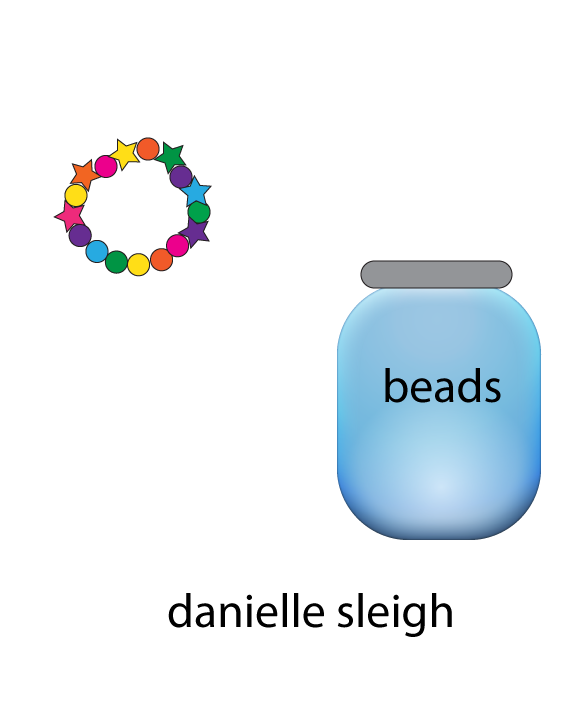
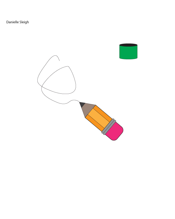
This is our first project in AI. First we had to make a pencil and can following the instructions given. Then we made a pencil and can on our own. After that we had to make two complimentary items. I made a bracelet and a jar of beads. Three takeaways were how to color on illustrator, how colors work together, and how to put many shapes together.

Tuesday, August 19, 2014

What Is Graphic Design

Graphic design is a way to advertise something; wether it be you, a product, a business, or anything else. Graphic design is used everywhere. Graphic design ranges from logos to architecture. It can make spaces interesting. Graphic design uses color, tile, light, text, and decoration to do this. Always do what you think is good first, then work through requirements. Make it mean something to people.