
Thursday, October 23, 2014
Is that supposed to insult me?
Spheres


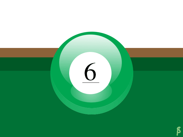 This is my PS tutorial ball. I did a Billiard ball. One part I had trouble with the shine just below the number. I solved it by, instead of feathering, making a gradient white circle and making it transparent. To make it my own, I made the ball green, with the classic 6 instead of the black 8 in the tutorial. Tutorial link.
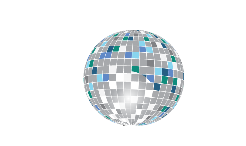 This is my AI tutorial ball. It is a disco ball. I didn't really have any troubles with it. I used a few different colors of blues for the coloring, and a gradient white & black screen circle to make that shine, though it did not turn out well. Tutorial Link.
Thursday, October 2, 2014
Personal logo

This is my logo sketch. I sort of stuck to one design with the D, S, and P. D is for my first name Danielle, S is for my last name Sleigh, and P is for my nick name, Pastel. I also just learned how to do that star. I really like it.

This is my art board. I tried a few more designs, including a heart with a lions made. I liked the star with the DSP and a lot of the sketches on the first board. I still went for the dap.

This is my final choice for my logo. It is the D and the P inside the S. The font is simple, and fits together, like my personality. The color is pastel pink, a somewhat elegant color. I really like it because its cute.
Wednesday, October 1, 2014
Multi-plane
Subscribe to:
Comments (Atom)