Wednesday, December 16, 2015

7 Nation Typography


The Kinetic Typography; A Scarce Resource.
Danielle Sleigh
_____________________________________________________________________
https://blogger.googleusercontent.com/img/b/R29vZ2xl/AVvXsEiSVeIoV_q4nRDLhZKyFSlGBQApAEmu8kDlpZb6NVMXfDnxIlCWR5CxHiAw2BvV8nQP2EnxZUyhPJECxEgDJdd23CS1ow7UPjBpJlN85EgQo_ocYbMsCD7d9pDtCKl-yTuXNYNAuCCkIUd1/s320/Screen+Shot+2015-10-29+at+2.19.33+PM.png

Summary


I've created a kinetic typography for 7 Nation Army by The White Stripes. The character I used in this animation is named Hitomi Shiga, and the animation is about her struggle through her job. I fit the color scheme of the video with the character. 


Story Boarding

https://blogger.googleusercontent.com/img/b/R29vZ2xl/AVvXsEhiMXecjOe70_GSxFOo5VVTrtVQFmvaN3uzfd1c7Avt-H-IiAVSvK4d4BP52jWK80NBi15hfZwY-4r_4_ecLqw-ncZ7sJxUBuvOJUtJnuq3Lu_TTTOIUWMuwQsQQAByAkv57zaTxUIr5oGU/s320/img013.jpg
Because of the story requiring lots of text, I typed out the lyrics on a word document, and just put them in the video section under the visuals. Also, instead of drawing everything out, I labeled each visual image I used with a letter and put said letter on the story board instead of a drawing. Some of the visuals had two parts, and some were used more than once. Untimely, this was not how I made my animation, but it was nice to have a point of reference. My goal was to get a good looking typography, and a steady verse animated. I think I was able to do that.


Making The Visuals

https://blogger.googleusercontent.com/img/b/R29vZ2xl/AVvXsEh-JwBgZGO91OmBQFlH_ZnxxPYrvkT25l4br23zWGMhDlftthpTJ_c89_JQDiMFuTvyMUmdO9cA9cBOvcBJ9b_cMmnh-YIpIw3HUhQzz5jfq_qfe4O1JJtXaPfKMkI72-QVWubaV5Miitmq/s320/oie_160118xYAVaFKi.jpg
https://blogger.googleusercontent.com/img/b/R29vZ2xl/AVvXsEiMLjhwhvwsCRw4ARecis5ZEKXmGeV-4CvnfgtA_ylAaZTaqcE6cbJyx_24PzdqKWtqijq37XIuiaZSXlSfmUsXhxS6rE361luH6CULuhvW6_CNx0prD3eH0u4exSD7M82EZMbkH0oENnra/s320/oie_1601016P31xi4nK.jpg
To start out, I sketched the visuals I planned to use, and labeled them for the purpose of my story board. I think the image I spend the most time on was the first visual. I used a few references to figure out how to draw a person from the back. After I got everything drawn out, I scanned them in the computer so I could make them on Photoshop. I made them as vector graphics, using the pen tool. Originally, I made the letter A image with the band connected to the rest of the image, but I changed something in my animation to make it visual that the band was getting ripped off her arm, so I took the band off her arm in the graphic by cutting it from the image and adding what was missing from the arm. I cut a few of the images because I did change the story board, and they could be a little hard to do as a vector graphic. I tried to keep simplistic, because I enjoy the look, and it would also look better in theanimation and with the font. The font I used is called Red Out. As a part of the visuals, it looks sleek and fits with the visuals and the song. The hardest part of making the visuals was the hat, I think. Both front and back had to be shown at one point. I had to use a few references; they were actually kind of hard to find. I based the character’s color scheme off of a school uniform with a coat. The band represents a disciplinary committee band to prove she is in fact in said committee.


Setting up the Project


https://blogger.googleusercontent.com/img/b/R29vZ2xl/AVvXsEjMJtPXqjLTgZa_PXyNOwD4IWb7PMVk0ZGH_C6AAKyDcuoRfuQclh9-Ggdwwvpx8inT4Wsrdc60RL9fq9MXPlJNK1g28q9RTvENwuNlrQbJaEwOQmtJ1COB4_WEHwMdfDPoGaFNAjjqfros/s1600/Screen+Shot+2015-10-08+at+1.37.28+PM.png


https://blogger.googleusercontent.com/img/b/R29vZ2xl/AVvXsEjxuhHF0oOt0nHAe_wUZpepHsv8QxRms5FPKdEtcB4dv-KuYtfNRM4JB9lLu3bA04FfT2eCLKO6OrTJKaeZXcQIvOttO-1sBs-KrHbwM-VlAtNUMzYQeq219UNRkVgB0PEcTqF86aNi9jm7/s1600/Screen+Shot+2015-10-08+at+1.36.05+PM.pnghttps://blogger.googleusercontent.com/img/b/R29vZ2xl/AVvXsEjVxGr4k8DWUyXbd0WZAaXm-vSq6fxS021ZbssDrkGwEtKn3mirIaW6qWETTOHGfURDi1jAUYcYXMEwpJzC7uZZrA_ESAUNb8JAGC6y7tVPVY87_zpZ-7O822BkdtyzL3t5VJUxYRmDdFjd/s320/Screen+Shot+2015-10-08+at+1.35.57+PM.pngI made this on After Effects, which is ideal for 2d animations, including typography, and also piecing together already done video or animated clips. I had to create a new project, then I had to get all my graphics into the project, as well as the music. I made a new composition in the project, and originally I made it too small, and I set the background as white, which contrasted with my moon and just did not look good in general. Tip: Always make sure you are animating in the animation workspace!


Animation time!


https://blogger.googleusercontent.com/img/b/R29vZ2xl/AVvXsEivSb0wkON0K_n9f8pW4hFIi1yfySOFD6AFUBNO2Ac2rLbeCpXqVQQLgHBE6xdHvdgKZiJbflXtOMsdsuIrzCoUmrKgANx8EJPfsouZ4siwrgIPJh_iHgqVIlgqkBhpOfkBPXMz91LIYA67/s1600/Screen+Shot+2015-10-08+at+1.37.19+PM.png

Getting to know After Effects and Your Workspace

https://blogger.googleusercontent.com/img/b/R29vZ2xl/AVvXsEjyyyx_F4ma2QjkWyz6DjCEq9QxJFK-SxQAbuocarbZlyGKfOA4iyVSVfGIlz6Cwbzf-Wi9qRBfCKl26WPtKjjJXZ4B5NDLhguD0mJHzhGluN21XqY_xzOJ-Se78P3GGoN1OssDPI5GIY-8/s320/Screen+Shot+2015-12-15+at+2.43.56+PM.pnghttps://blogger.googleusercontent.com/img/b/R29vZ2xl/AVvXsEgchSTGyWsnQ182HoZ0qGtTQpKFR1mZWhnDI8ESYXXCrMTUYVbOBcuvZYoc2EpFUd0GyVDuIiJIUhPiv89zeBXyvl7CdRgz-Xw6vXgyClzp1Lxfs7u-ZFfjTKvTKMo2GhEU6m06BAVIhhxK/s1600/Screen+Shot+2015-10-08+at+1.35.44+PM.pnghttps://blogger.googleusercontent.com/img/b/R29vZ2xl/AVvXsEj0pP2mtHSGNBxBbl4_tjmLxF5gFQVw-o8G4NR9KdApnNqh7fSaqvWtwqx_eRwfwZbPh5IroOQWYq7dY-K4I0q4Cgb_1Mx978zPX9l-bnhd6oHG_QCXvneI3pUKmbOcLLRn4of2y0FWISBP/s320/Screen+Shot+2015-10-08+at+1.36.33+PM.pngThere are a few things not already mentioned that help a lot to know about when using after effects. The first is your tool bar. The things I use on my toolbar for the typography are the regular pointer arrow, which lets you move around your text and images, the hand which lets you pan, a magazine glass which is your zoom tool, the object tool that… makes objects, the pen tool, which also works as a key frame manipulator, and finally, the all-important text tool, which has a rather obvious purpose. Next, for creating effects on your text, you have the effect control drop down on your main drop down bar. I use the text manipulation the most, but that can also be accessed through the layer editor. You also have key frames. Those signify a change to the object, it moving, changing opacity, ect. Not counting key frames, I think the tool I most used was the guides and rulers. They are a very nice thing to have. I used them to line up all the text, and make sure there was even space between words. They were also good if you needed a perfect line for a movement key frame. A basic tool that you don’t notice you use is the time line. It is pretty self-explanatory.  You use it to tell where you are in the song, in frames, and it really helps when lining up key frames.
https://blogger.googleusercontent.com/img/b/R29vZ2xl/AVvXsEj7bF6IOc1rvV4KWjIuTFdKMRCCEtTR7xXnbKY73vBKvw0_eWF5KdeIszUGBV7BBYTsAIKKlD6Iw2Rt5UBFjkGPYUFHsJOJqWTI2y8LMHRkfeCC1l9L1OVtZjve85pGQySqK3aVEvToLjd-/s320/Screen+Shot+2015-11-10+at+2.02.40+PM.png


Your Best Friend is the Hide Button

https://blogger.googleusercontent.com/img/b/R29vZ2xl/AVvXsEhTkPzryQlSvgsb6e6aXespzflmYNDEau81Zev3sH7ZXXe7VLS8-1nn0ps6iyc9Ahjek3ZjYefroLVf1QTuR4IXlyyhx_-xQbIkCnNzI6f6PvGn1riHovMFp5PD62s0M_r_Z7zm0pQ58jGT/s320/Screen+Shot+2015-10-08+at+1.35.01+PM.pngAlmost every single word is its own layer, which adds up to a lot BEFORE factoring in the objects, images, and the music you have to add in. When not working with a set of words, objects, and images, you can click a little button that looks like a guy at a table to represent the layers you want to hide. It helped a lot when I needed to match to the audio waves.


Syncing Text to Audio


When you are messing with the text (making it move, warp, ect.) you create key frames to signify change. A very simple way to make sure you have text synced with the song is to listen. You want your word to be fully visible and finished changing by the time they finish saying the word in the music or speech. When it comes to music, if you have text that is not sung, then you want to line it up to a beat. You can open up your audio wavelengths really simply. Line up your scrubber with the major bumps in the audio, which is where you will find a consistent beat that works to sync your words to.

https://blogger.googleusercontent.com/img/b/R29vZ2xl/AVvXsEj3myw1cHUKliqCj1x-0x0aYhyphenhyphenWFGFqc-yTdyjopDYmHrZadQ2u_Sn663RXlH4Xu8ijjdZzU316GW4T-pqHGrmcnMX6D0Snq3AV8notzpU0oS8nU8FwWwXjcLGpEmeQC2DEEGZiitr8UDQ5/s320/Screen+Shot+2015-12-15+at+1.22.00+PM.png

The Finished Product


After about 120 hours give or take, I finished my typography. The biggest challenge was not getting the music or putting things in, but the timing and just the appearance of the next and its alignment. I really enjoyed making this typography, even with the stress it caused. It was really fun to tell the story through words, and play with the way words could come in. The most annoying thing about the typography was listening to the song 20 times an hour. If you are going to make a typography, keep that in mind.


Friday, September 4, 2015

Pixel Effect Review


Yes. I am going to critically analyze the movie Pixels, directed by Chris Columbus. This movie is mostly live action, but it relies a lot on 3D effects and other animation. Without that, Pixels would not have worked out the way it did. They used the pixel aspect a lot, meaning they made things pixelated like an 80's video game would.

I would like to point out the application of the pixelation to real life people and objects. In the beginning an army base is attacked, they are shot and the building pixelates and falls into little glowing boxes that are in fact animated. 
The second time they used this was when scientists in the lab were looking at one of the pixels to see what it was like, and what they could use to destroy it or break it up. They use light guns, which are also animated. 
In the scene where they were fighting Pac Man, they used this effect multiple times. The creator of Pac Man went up to the alien Pac Man and reached out to him, but Pac Man bit him, and his arm pixelated like they did with objects in the past, which was probably very complicated. During the same sequence, Pac Man is destroying the city like seen here, causing more pixels.                                                                              Multiple times in the movie, the aliens abduct people, and in the abduction guess what? They turn into pixels, and reformed inside the ship.           The animation of the movie was very good, and, disregard all the acting and plot holes, I would give it an 8/10. There were minor glitches a trained eye could notice, but nothing causing too much problems. It was just pretty mediocre.

Monday, May 18, 2015

Lions are the Best


For the final project, I worked with Katie Arpin and Jessica Love. We had to make a product box that has a second function. Our product was stuffed animals, and we named it Cirque de Lecture (cirk dry lector). We made a circus/zoo kind of line, and the box would double as a train car or a showing cage for the stuffed animals. We each decided on an animal, a lion, fox, and wolf. My part of this project was to make the template, 3D revolve, and marketing plans. I also helped with color scheming because I love to do that stuff. I really enjoyed working with my group. I think we did well. Our biggest problem was creating the die line. We had forgotten how, but I managed to fix it and make the box look great!Our target audience is children, or anyone who loves stuffed animals. They are based on zoo/ wild animals, so they will be directed at those who like things such as lions, wolves, foxes, ect. Being a train, it could also go to people who like trains.

Cirque de Lector is a series of stuffed animals you would find in a zoo or circus setting. They will be animals children like, find cute, or based on animals that sell well to children. Our box design is a train. When you take your animal out of the box, it will be removed from the back like the door of a circus train car. The box will have holes like cage bars, as if you could reach in and pet the animal. You can reuse this box, and make chains to link it to the other animals boxes. Inside of the box, other than the animal, will be a set of links to connect the box, or “train car”, to others.

Friday, May 15, 2015

Glitter BOX


box template
Armstrong Seal of Approval
The product I picked for this project was Glitter Box. Originally, It was going to be a box that sprayed glitter when you opened it, but then I found out about edible glitter. So instead, it is pills of glitter you can put in your drinks, put in cake mixes, or just eat as the tablet its self. I had a lot of fun designing the box. It's colors reflect the happiness and upbeat emotions of glitter. The design and font is all simple. The font is called Manga Temple. I used it for the logo font (both the text and initials), and on the testimonies. For the seal of approval I used Myrad Pro, trying to match the labels on the back. The right side has a seal that says "Armstrong Approved." It is to show that the glitter does in fact sparkle to the best of its standards.  I tried to make the bottle label simple. I wanted the entire bottle to be the same color, so the label blends into it. The yellow was made as the label color because it seems like more of a pill or medication associated color. I only put the glitter box logo on because I didn't want it to be over complicated. Because the bottle comes in the box, I didn't feel it needed the bar code. I'm all about simplicity.
Label
3d revolve

My 3d revolve was fun, but gave me the most problems. I had trouble getting the box to be pink and mask the yellow to make just the sides yellow. The bottle was also hard, because in order to make it look good, you had to get the proportions exact. After I made the box and bottle, I decided to make the pill itself, which was easy. The only problem with that is that, due to its texture, it does not look 3d. I do still like it and would not change that part. My logo design was my favorite part. I went through a lot of concepts and enjoyed each and every one of them. I had to design the icon, font, and initials at different times to see what looked best, then I could put my favorites together to see that. A lot of my fonts were customs I found online. In the end I did decide on one that worked for both my full text and initials. I was trying to decide between upper and lower case for them.
font ideas
icon


initials ideas


glitter pill texture.

more font stuff
logo ideas
final logo design


Friday, May 8, 2015

Art thingies


On my own, I'be been playing with shading and skin coloring. Actually pretty happy with how the first one turned out nice. The only problem I have with the second one is proportions. I don't usually draw even/ full faces with realism, so it did turn out well considering that.

Friday, April 10, 2015

Custom type

         We made our custom type in adobe illustrator, using a tutorial. The font I used was "Baby, You're a Star" which is a font I downloaded for an old project. Originally, all the text was in one line. We had to expand the text, turning it into objects with points, to be able to move it. I ungrouped the "apple" from the "organtics" so I could move the organtics on its own. I liked the first p in "apple" and the r in "organtics" to make the drop down and the lead up look like they were the same. The second p also ended up looking merged with the g.

Thursday, March 12, 2015

Gourmet cat (food)


ABOUT

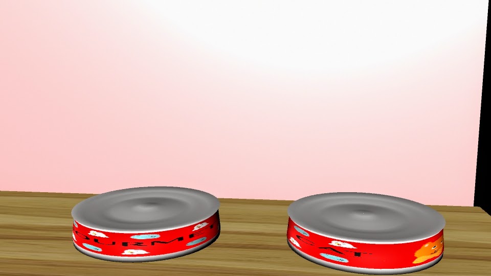
In this project we had to make a container for a product. I went with cat food in a can. I spent the most time on my label, and I really like it. Being gone for about a week, I missed a lot of what we were doing, but I caught on quick. I made the can first, a cylinder. I had to expand the sides of it to get the right shape. I used extrude to make the indents in the top and bottom of the can. For the label I drew all the pictures and logo, and used a pre-installed font for the title. I grabbed a bar code off the internet.


Thursday, March 5, 2015

Top Ten

the X means there
will be an image.
The filled in means there
will be empty space
We've been working on a new project for about two weeks. It is our Top Ten posters. We were introduced to in design. To begin we had to look up and sketch some concept grids that we liked for our poster. I really liked a lot of the simple ones like shown. I ended up going with my own design, where the text is always right of the photo. I pulled my grid and made it in in design. Next I found all the photos. The first few (Fullmetal Alchemist, Google Chrome, 3DS) were easy. All I had to do was throw them in and center them. For music I could not decide who I wanted to be my image, so I took a picture of Marina and a picture of Nicki Minaj, and I cut both in half so that it could be one photo with both of them, while maintaining a good size. For my cosplay and horse photos, I had to edit it out, so the main focus was the cosplay and the horse. With my picture of my dogs, my friends, and my family, I had to correct the colors quite a bit. They were dark, and you could hardly see anything. But they look a lot better now. The color design I picked was because it is pretty like me. The filler photos were picked to match. After i set the background I had to set the fonts. for the heading (in pink) I downloaded the free font "Baby, you're a star". I really like how pretty it is, and how it relates to me. for the subheadings (in blue) I used the font "Letter Gothic Std". It fits in well with the simple theme, drawing attention, but not distracting. For the body I used PT Serif. Its simple and easy to read.


Thursday, February 5, 2015

Let it Snow :D

Snowing.
       This is our snowflake project. We started with the draw polygons tool. We drew a weird shape, then mirrored it. We then combine and mirror-rotated that six times to get a snowflake. Once we had at least six done, we put them all into one file, and extruded them. We smoothed them so they would look more like snow. Then we applied textures to them. I used a seamless ice texture. Next we had to make the wall with a window. We made a plane then added divisions, and extruded a few. From that, we intruded a few, and applied a semi-transparent texture. We imported the scene with the complete snowflakes, and made it look like they were falling. When I tried to import the image sequence to after effects, the background was red- the default background for after effects. I went back into Maya and added a plane in back of the snowflakes, coloring it a dark blue like it was night. Then I re-rendered and put it back into after effects. Problem solved!

MAYA


Polything


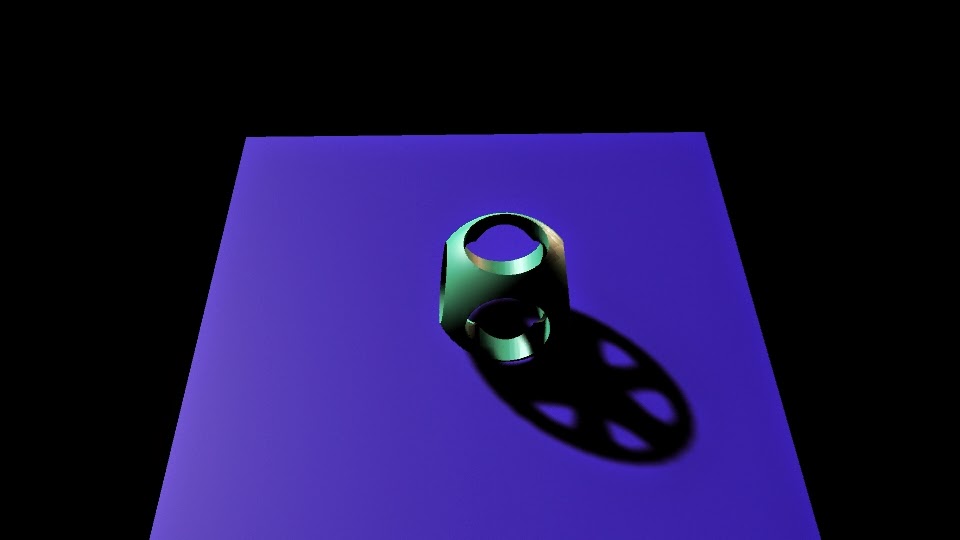
This is the polishing. With this project, we practiced booleans, creating holes in the rounded cube. We also worked with lights and shadows. First, we made a cube, and rounded its edges. Then we made two cylinders and booleaned them out so that it had holes it it. We made a plane on the ground. Then we added a subject light at an angle.

Revolve Cup


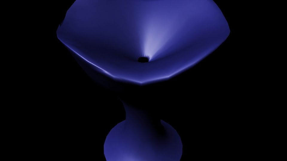
In this project we used the polygon creator, and edited vertices and NURBS. We started with the create nurb tool. Then we created the cup and applied a texture, then added lights.


Bounce


We animated with maya in this project. We had to use timing to see when the balls would bounce up and down; we started with a video of each ball bouncing. Then we made the two planes, and three balls of different sizes. We added the textures and pulled everything together. We rendered out and pulled them into aftereffects to render the movie.

Hammer and Nail

In this project we had to make a hammer and nail. We used extrude and vertex editing. We starred with a single rectangular prism. We extruded the front and back of the head to make it look more like a hammer. On the back we edited vertices to make it look real. We applied textures and added a light, then rendered the image.


Ice Cream  


We made Ice cream, a cone and its holder, a bowl, a scoop, and a table. we used a lot of textures and lighting. We had to use about three different types of textures. We started with just the table, but then continued from there. The bowl is a cylinder with boolean difference. The scoop is a cylinder and a sphere with boolean difference. The cone is a cone with boolean difference. The ice cream scoops are all spheres. The holder is two rings, and three cylinders. The table is four rectangular prisms. We had to make two planes as the back ground. The textures include wood for the table, cloud for the ice cream, a simple phong for the holder and scoop, and a lambert for the bowl


Pen


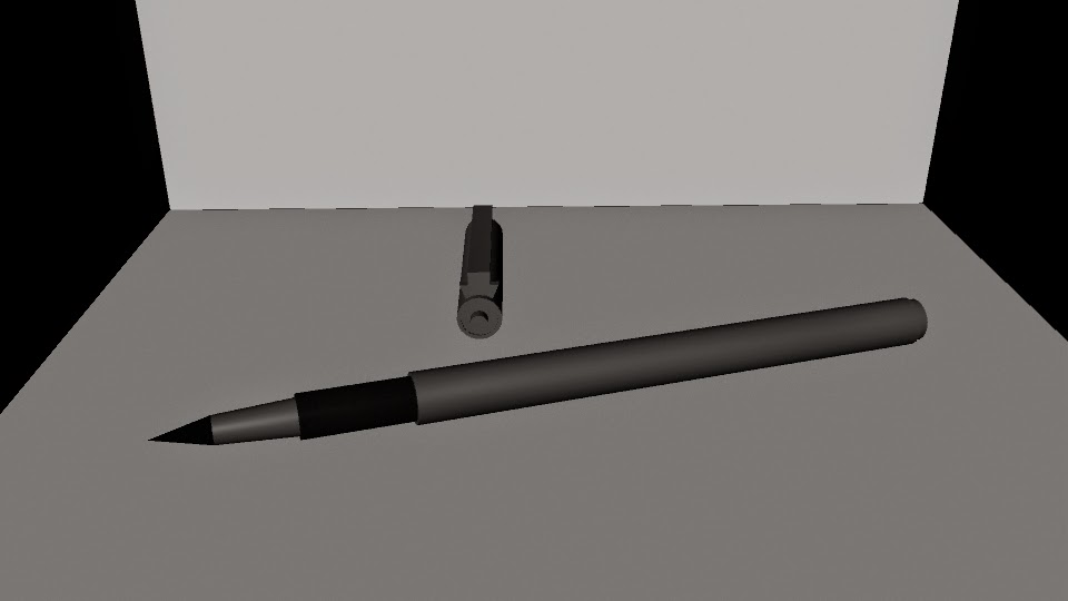
For our final we had to model a pen or pencil. I picked my felt lining pen. We used a lot of combining in this. First, we started with a cylinder. Then we added onto it with each shape of the pen. I used three cylinders, a cone, and a rectangular prism. The hardest part was the cap, because of the clip. 

Sprinkle Shaker

We had to model out a salt shaker (or another type of dispenser) in this. A lot of it was editing vertices and sections of the polygon- aka lofting. I made a sprinkle shaker. We started with a circle curve. We selected four of the vertices and pulled them in a little. After that we made a few more of the curves, scaling each differently. Then we made the cap. It was a half sphere. We had to difference cylinders from it for the holes. After that was done We took the curve circles and lofted them. Then we took that polygon it created and duplicated it, scaling the second one down. The first one has a semi-transparent texture to resemble glass. The second one has a sprinkle texture. The cap has a phong grey.