
Wednesday, May 13, 2015

Friday, May 8, 2015
Art thingies


On my own, I'be been playing with shading and skin coloring. Actually pretty happy with how the first one turned out nice. The only problem I have with the second one is proportions. I don't usually draw even/ full faces with realism, so it did turn out well considering that.
Friday, April 10, 2015
Custom type

Thursday, March 12, 2015
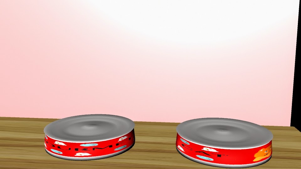
Gourmet cat (food)
ABOUT
In this project we had to make a container for a product. I went with cat food in a can. I spent the most time on my label, and I really like it. Being gone for about a week, I missed a lot of what we were doing, but I caught on quick. I made the can first, a cylinder. I had to expand the sides of it to get the right shape. I used extrude to make the indents in the top and bottom of the can. For the label I drew all the pictures and logo, and used a pre-installed font for the title. I grabbed a bar code off the internet.

Thursday, March 5, 2015
Top Ten

 |
| the X means there will be an image. The filled in means there will be empty space |


 We've been working on a new project for about two weeks. It is our Top Ten posters. We were introduced to in design. To begin we had to look up and sketch some concept grids that we liked for our poster. I really liked a lot of the simple ones like shown. I ended up going with my own design, where the text is always right of the photo. I pulled my grid and made it in in design. Next I found all the photos. The first few (Fullmetal Alchemist, Google Chrome, 3DS) were easy. All I had to do was throw them in and center them. For music I could not decide who I wanted to be my image, so I took a picture of Marina and a picture of Nicki Minaj, and I cut both in half so that it could be one photo with both of them, while maintaining a good size. For my cosplay and horse photos, I had to edit it out, so the main focus was the cosplay and the horse. With my picture of my dogs, my friends, and my family, I had to correct the colors quite a bit. They were dark, and you could hardly see anything. But they look a lot better now. The color design I picked was because it is pretty like me. The filler photos were picked to match. After i set the background I had to set the fonts. for the heading (in pink) I downloaded the free font "Baby, you're a star". I really like how pretty it is, and how it relates to me. for the subheadings (in blue) I used the font "Letter Gothic Std". It fits in well with the simple theme, drawing attention, but not distracting. For the body I used PT Serif. Its simple and easy to read.
Thursday, February 5, 2015
Let it Snow :D
Snowing.
This is our snowflake project. We started with the draw polygons tool. We drew a weird shape, then mirrored it. We then combine and mirror-rotated that six times to get a snowflake. Once we had at least six done, we put them all into one file, and extruded them. We smoothed them so they would look more like snow. Then we applied textures to them. I used a seamless ice texture. Next we had to make the wall with a window. We made a plane then added divisions, and extruded a few. From that, we intruded a few, and applied a semi-transparent texture. We imported the scene with the complete snowflakes, and made it look like they were falling. When I tried to import the image sequence to after effects, the background was red- the default background for after effects. I went back into Maya and added a plane in back of the snowflakes, coloring it a dark blue like it was night. Then I re-rendered and put it back into after effects. Problem solved!
MAYA
Polything
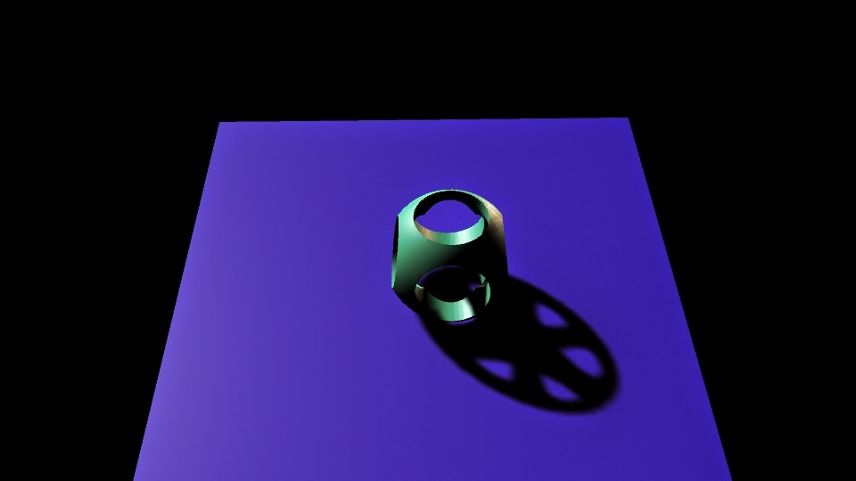
This is the polishing. With this project, we practiced booleans, creating holes in the rounded cube. We also worked with lights and shadows. First, we made a cube, and rounded its edges. Then we made two cylinders and booleaned them out so that it had holes it it. We made a plane on the ground. Then we added a subject light at an angle.
Revolve Cup
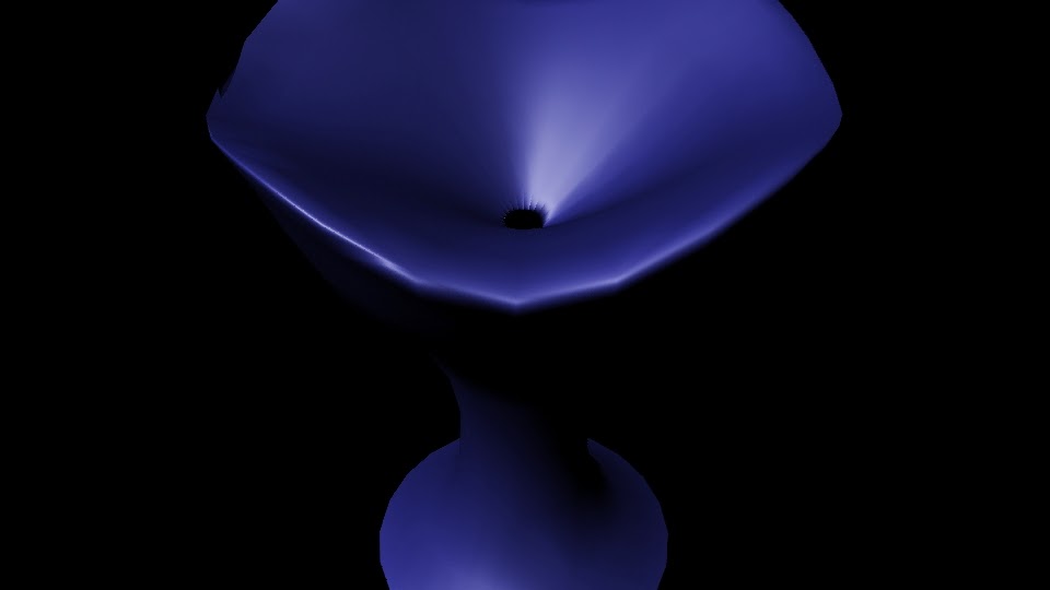
In this project we used the polygon creator, and edited vertices and NURBS. We started with the create nurb tool. Then we created the cup and applied a texture, then added lights.

Bounce
We animated with maya in this project. We had to use timing to see when the balls would bounce up and down; we started with a video of each ball bouncing. Then we made the two planes, and three balls of different sizes. We added the textures and pulled everything together. We rendered out and pulled them into aftereffects to render the movie.

Hammer and Nail
In this project we had to make a hammer and nail. We used extrude and vertex editing. We starred with a single rectangular prism. We extruded the front and back of the head to make it look more like a hammer. On the back we edited vertices to make it look real. We applied textures and added a light, then rendered the image.


Ice Cream
We made Ice cream, a cone and its holder, a bowl, a scoop, and a table. we used a lot of textures and lighting. We had to use about three different types of textures. We started with just the table, but then continued from there. The bowl is a cylinder with boolean difference. The scoop is a cylinder and a sphere with boolean difference. The cone is a cone with boolean difference. The ice cream scoops are all spheres. The holder is two rings, and three cylinders. The table is four rectangular prisms. We had to make two planes as the back ground. The textures include wood for the table, cloud for the ice cream, a simple phong for the holder and scoop, and a lambert for the bowl
Pen
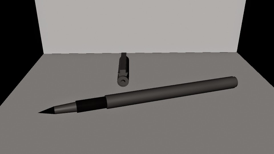
For our final we had to model a pen or pencil. I picked my felt lining pen. We used a lot of combining in this. First, we started with a cylinder. Then we added onto it with each shape of the pen. I used three cylinders, a cone, and a rectangular prism. The hardest part was the cap, because of the clip.

Sprinkle Shaker
We had to model out a salt shaker (or another type of dispenser) in this. A lot of it was editing vertices and sections of the polygon- aka lofting. I made a sprinkle shaker. We started with a circle curve. We selected four of the vertices and pulled them in a little. After that we made a few more of the curves, scaling each differently. Then we made the cap. It was a half sphere. We had to difference cylinders from it for the holes. After that was done We took the curve circles and lofted them. Then we took that polygon it created and duplicated it, scaling the second one down. The first one has a semi-transparent texture to resemble glass. The second one has a sprinkle texture. The cap has a phong grey.
Subscribe to:
Posts (Atom)